EPISODE 002
Build a Design System with AI
Coming Soon
I'm not a graphic designer.
I've worked with incredible ones. I know what good looks like. I can point at a landing page and tell you exactly why it feels like a WordPress template someone paid $49 for — and I can point at another and explain why it makes you want to give that company your credit card.
But I can't open Figma and make that second page myself. Or at least, I couldn't.
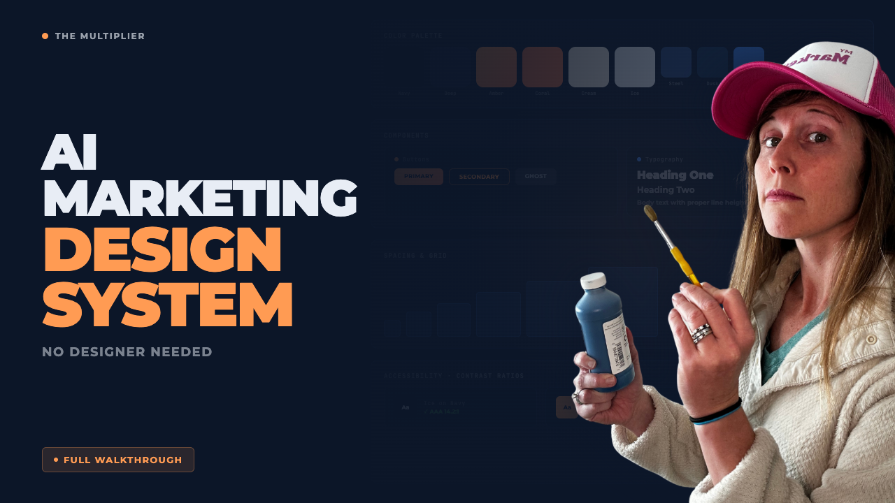
Three weeks ago, I set out to build a design system for Synapsa — not just a color palette, but a full system. One that could scale across our marketing site, sales decks, PDFs, and eventually power the AI agents we're building to handle content at scale. By day three, I could generate any type of page in one to three prompts. Brand-consistent. Premium-feeling. The kind of output that makes other founders ask "who's your designer?"
Every SaaS company faces the same tension. You need enough visual range to work across formats. But if your system is too flexible, you end up looking like everyone else.
I dumped everything into the conversation.
Screenshots of our existing assets — the ones I loved. Screenshots from SaaS companies I admired (I dropped names). Our current color codes. My complaints about what wasn't working. I even mentioned that my go-to outfit — cream sweatshirt, jeans — had somehow become the unofficial Synapsa brand aesthetic. (Claude didn't judge.)
Then I started asking questions:
Where should our bold orange live versus our anchoring navy?
What would a senior creative director say about this palette?
What's missing that would give us range without losing cohesion?
This wasn't "generate me a color palette." This was a working session. I'd push back. Claude would explain. I'd show it pages I'd built that didn't feel right. It would diagnose why.
The first attempt wasn't good. Neither was the second. But each round, we got closer.
A palette on paper means nothing. You have to see it in context.
So I started building pages. Real pages. And every time something felt off — too flat, too cluttered, too "template-y" — I'd stop and describe exactly what I didn't like. Then I'd describe what I wanted instead.
This is where most people quit. They get a decent output and ship it. But decent isn't the goal. The goal is a system so dialed that any future page comes out looking like a creative director approved it.
Every diagnosis became a rule. Every rule went into a markdown file that Claude would reference on future builds. The guidance got sharper with each iteration:
"Use navy for grounding elements. Coral for warmth and humanity. The amber gradient is reserved for primary CTAs and brand moments only. Cream backgrounds create breathing room — don't fill them with competing elements."
By the end of day one, I had a page I thought looked incredible. By day two, I had three more. By day three, I had a system.
Here's what nobody tells you about working with AI: the magic isn't in the first output. It's in building the feedback loops that prevent you from making the same mistake twice.
Early on, I kept putting design decisions in the wrong place. Inline styles when it should've been in the CSS. CSS when it should've been in the design tokens. I'd request an edit, and Claude would make the change — but in a way that created technical debt I'd have to clean up later.
So I built a skill for it.
Not a complicated one. Just a set of instructions that helped Claude interpret my requests correctly: Is this a design system change, a CSS change, or an in-page override? That one skill saved hours of rework.
Then I built more:
A skill to generate section variants so I could preview alternatives before committing. A skill to QA pages for SEO and production-readiness before launch. A skill that summarizes what we did, what we learned, and what should be codified at the end of every session.
The point was never to avoid mistakes. It was to capture them. Turn them into rules. Make the system smarter every time something went wrong.
If there's one pattern that made this work, it's this: I never stopped asking questions.
Not "make this prettier" questions. Diagnostic questions:
What would a great UI/UX designer say about this?
What could go wrong if I make this rule absolute?
What would have to be true to ensure A, B, and C happen — but D doesn't?
Have you double-checked this against my style guide?
Where did the style guide lack clarity that caused this miss?
These aren't prompts. They're the questions any senior operator asks when they're building systems instead of just shipping tasks. The AI doesn't replace that thinking. It multiplies it.
Two technical decisions made this possible.
First, I moved to Astro — a web framework that let me work with components the way I understood them from Figma and low-code tools, but with the flexibility to modify and extend. I didn't need to become a developer. I needed just enough code literacy to understand what I was asking for.
Second, I leaned hard into Claude's skills system. I started with the built-in frontend skill. Then I started writing my own — small instruction sets that encoded the patterns we'd learned. Each skill was a piece of institutional knowledge I didn't have to remember or re-explain.
By the end, I had a stack of skills that turned vague requests into precise outputs. Not because the AI got smarter. Because I'd taught it exactly how I think.
Here's the part that's hard to convey: the first day is exhausting. You're building the system and using it at the same time. Every output requires inspection. Every miss requires diagnosis. You're not moving fast — you're laying track.
Day two is faster. The rules are starting to hold. The skills are catching errors before they ship. You're spending less time fixing and more time creating.
Day three is when it clicks.
You describe a page in plain English. It comes back looking like a creative director built it. You make a tweak, and the system knows where that tweak belongs. You're not fighting the tools anymore. You're just... building.
That's the multiplier.
I didn't build a design system by becoming a designer. I built it by doing what operators do: asking better questions, codifying the answers, and creating systems that scale.
The AI didn't replace my judgment. It extended my reach.
Every operator reading this has domain expertise the AI doesn't have. You know what good looks like in your field. You know the difference between "technically correct" and "actually effective." You know which rules matter and which ones are theater.
The question isn't whether AI can help you. It's whether you're willing to do the upfront work to teach it how you think.
Three days. No designer. A system that now produces brand-consistent pages in minutes.
Not because I took shortcuts. Because I built the track first.
Subscribe and get each episode as it drops.